ANTHONY CONN GALLERY
THE COMET
I decided to play up the old stars and moons motif of his costume by using actual star field photos from space. Also, dropped the visor and turned the volume up on the laser eyes…

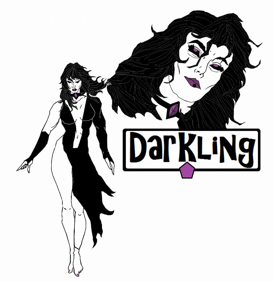
DARKLING
I kinda dig the recent MIGHTY CRUSADERS book’s darker take on the character, so I decided to play around on with that …
DOC REEVES
Crusaders Reimaginged- Doc Reeves
For an aquatic based character, I never understood Doc’s choice of hi-tech wetsuit hues. Was he trying to emulate a fisherman’s rain slicker with the orangeish-yellowish-beigeish scheme? If you’re gonna be underwater, I’m assuming you’d want some stealth and camouflage when hunting bad guys, so I streamlined the piping, expanded some of it and went with blue and white.

THE FLY
Really enjoyed the latest take on the character, Firefly, and decided to take her back to her roots. Also, I like the idea of there being a legacy character in the Crusaders…isn’t she supposed to be the daughter of the Troy family?

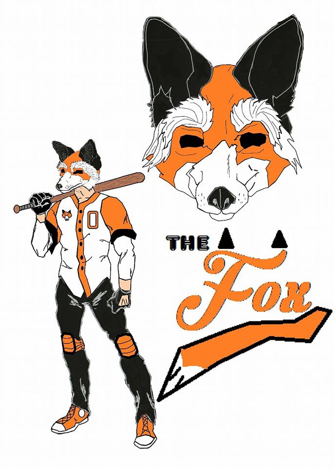
THE FOX
The Fox’s costume always kinda looked too much like Marvel’s Black Panther. I decided to go with a complete overhaul…
An idea that I’ve always kinda dug is a super hero costume that’s a found object….like, a real world garment that’s repurposed. I’ve always thought a sports mascot costume would be an interesting choice to kinda play around with….plus, I’ve been contemplating going as a Baseball Fury from THE WARRIORS again for Halloween…
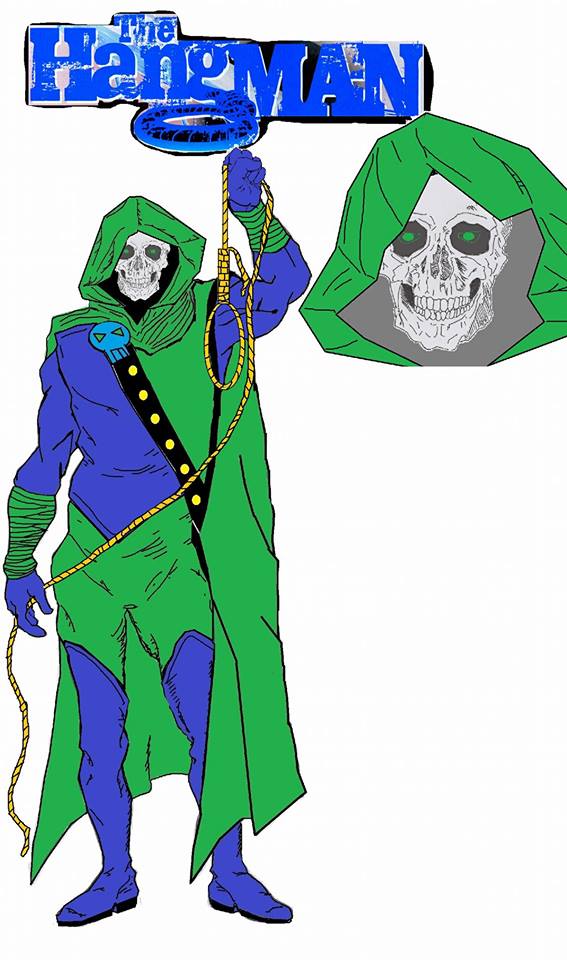
THE HANGMAN
In this redesign, I kept the green and blue color pallet, upped the ante on the harbinger of death motif with the skull, and did a little weird thing with the cape having a hood and a strange tunic flap thing that buttons, creating the look of a robe somewhat. I don’t know how functional it be, but it looks cool…..
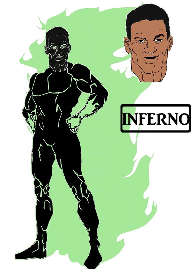
INFERNO
Being only really familiar with the Impact and DC Red Circle versions of this character, I kinda went into this redesign not really beholden to any previous incarnations of the property. I kept the design pretty simple and minimalistic, and just played up the idea of a guy in fire with an interesting color scheme.
THE JAGUAR
I decided to run with a female version because I loved the Impact book and push the premise into a sort of feral territory but streamline it….simply because I was a Tigra fan as a kid.
Plus, jaguar spots are a pain to edit digitally. .

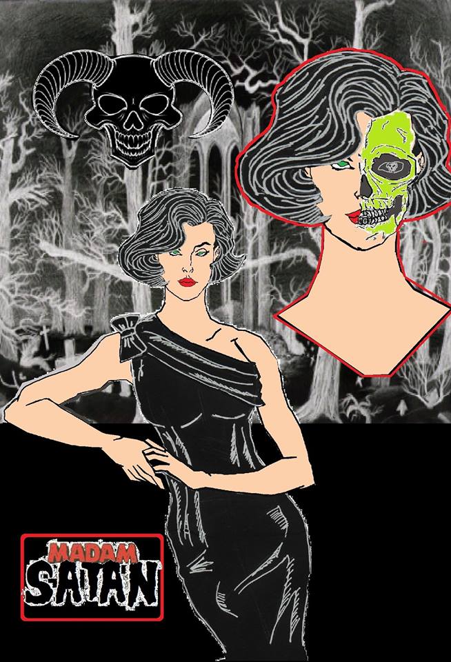
MADAM SATAN
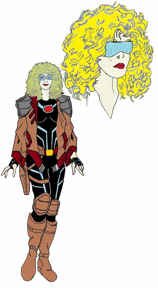
MARVELOUS MAUREEN
Now, I know that Maureen doesn’t technically fall in the Crusaders canon, being an Archie humor strip (and one of the odd instances of being a creator-owned properly, as well), but I’ve always dug the strip (due a lot to the relative uniqueness of it compared to anything else appearing in humor titles like PEP at the time of publication). Also, the Crusaders ranks don’t really have a Flash Gordon/ Adam Strange style pulp space adventurer.
Things got kinda weird during the development of this piece…I started liking the idea of aging Maureen ( sort of real-world aging and thoughts of how faster than light travel would work in a weird way in the sliding timescale of comic book continuity. ..if Maureen was a teen in the 80s, she’d be….fortyish now.).
As far as design wise, I had crazy concurrent thoughts of “female cinematic Starlord”, TRON….and, Ellen Ripley.
These are the kinds of ideas that pop up when I get a few days off from work and decide to just sit around the house. …lol
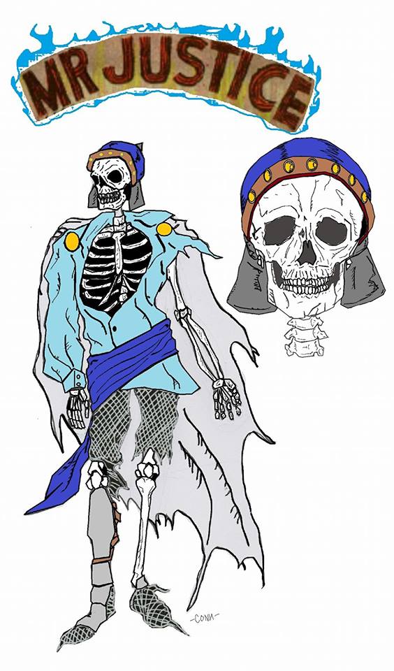
MR. JUSTICE
So…..I’m thinking….he’s a ghost of an 11th Century nobleman. A really old ghost (at this point, he’s almost a literal Millennial). And then I did a little research on 11th Century clothing. …everybody kinda dressed like Hal Foster’s Prince Valiant comic strip. For men, it seems it was a tunic and leggings, so I went with that, tattered with a thousand years of age, with remnants of armor for accent. I kept the powder/dark blue and white color scheme, and due to his longtime undead status, made him skeletal.
Or….maybe I’ve seen too many BLIND DEAD movies….lol
MS. SAMSON
During the 1980s attempted relaunch of the Archie characters, Ms. Samson was introduced as a
supporting character in Steel Sterling’s book, interesting in the respects that I wanna say it was one of the superhero genre’s first example of a diversified couple (“Blonde haired, blue-eyed white guy poster boy Steel was dating a lady of color? How shocking!”…please insert nasally Thurston Howell type voice when reading for effect…I’m thinking Iron Fist and Misty Knight preceded this by not too many years)….and, it seemed like she never wore too many clothes….a bikini and headband seems to have been her look, and according to a most music videos from the era I’ve seen….that was standard issue, right? Having never been a young lady in the 1980s (I woulda been a 9 or 10-year-old boy in 1983/84 when I first encountered Samson on the comics page) seems to leave me at a disadvantage when it comes to women’s fashions.
So, she was a tall, muscular African-American lady who was super strong. Kinda like Grace Jones….only without the weird haircuts…..so, not much a redesign, but maybe an update to her look. And….barbells always denote strength in cartoons. I learned that from Bugs Bunny.

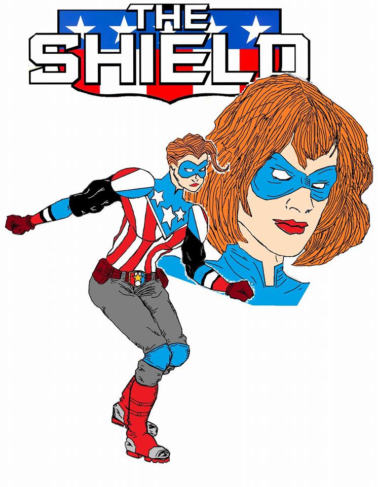
SHIELD
Was bored, so I decided to doodle a new costume design for the current incarnation of The Shield. Then I scanned it, and after some digital edits and coloring …
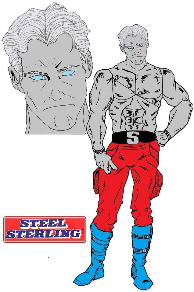
STEEL STERLING
When I started thinking of doing a Sterling piece, I thought “Doc Savage….actually made of bronze “. Or, in Sterling’s case….steel.
I have a feeling from what I’ve seen of the unpublished second wave of Impact books, they were thinking in the same direction.
I added the rivets across the chest and wrists, even though they make no sense, 1.) To stress the idea of literal steel, 2.) I thought it looked neat, and 3.) Most of the guys I know into bodybuilding are weirdly into body modifications. …tattoos and such. And, how would a guy with actual steel skin accomplish modification? Rivets. It’s weird but makes sense.
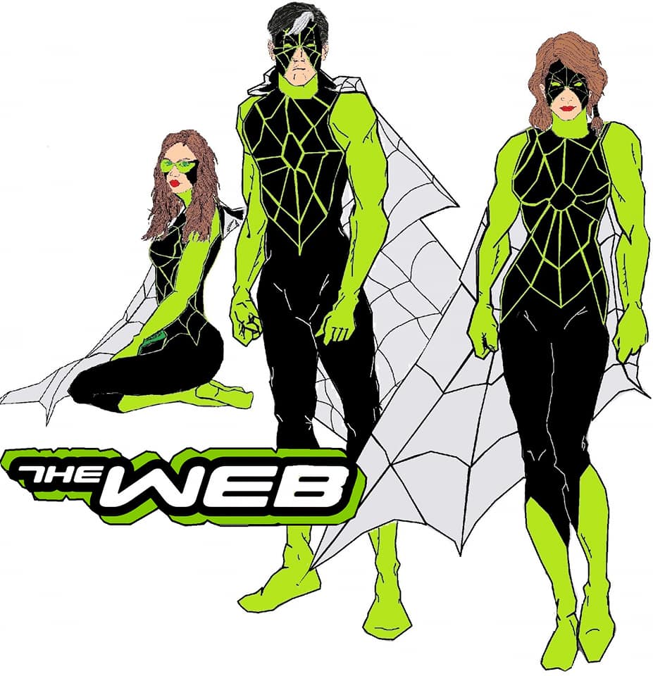
THE WEB
In the 1960s, they attempted to relaunch the character and the writer tried to give the strip a weird camp comedy twist: he was a henpecked husband whose wife frowned upon his superheroics….kinda like THE FLINTSTONES or THE HONEYMOONERS with masks and capes…..so, I decided to switch that scenario up a bit….some time has passed, and now he’s an overprotective dad dealing with daughters who want to follow in his costumes footsteps. There’s a sitcom in all of this somewhere, and when I find it, I’ll make a million pitching it….lol
I’ve always dug the Impact take on the premise: a “web” or network of operatives working under a single public persona, so maybe there’s not only multiple “Webs” in one family….but perhaps….it’s like a franchise. A Web in Ohio, another in New York., and so on and so on. Kinda like the old goofy “International Batmen” idea from the Silver Age…
RADIO COMICS
PEP COMICS #1
The PEP Squad was an idea that stemmed from the fact that the Crusaders mythos has never had a Teen Titans/New Warriors kind of sidekick/teen heroes kind of team….and I wanted to do a Blackjack and Bob Phantom redesign.

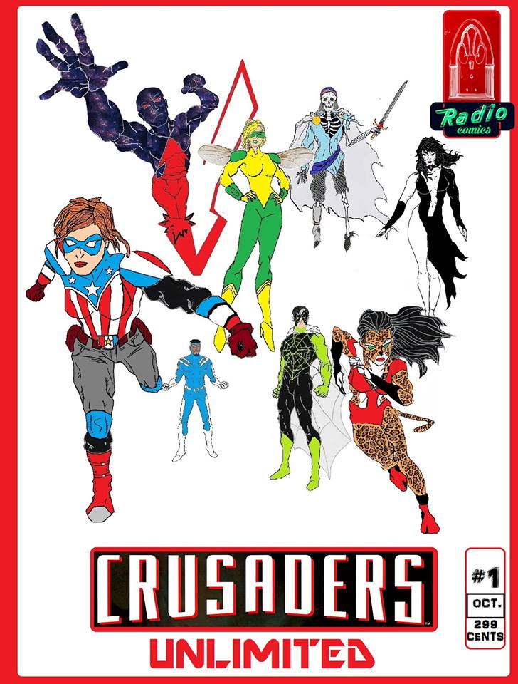
RADIO COMICS
My little attempt at fanboy daydreaming, a new Crusaders team featuring my designs…
Tagline: The Crusade Never Ends….
RADIO COMICS
ZIP COMICS #1

One of the tropes of the superheroic genre that I absolutely adore is the funny animal superhero parody. Everything from Fawcett’s HOPPY THE MARVEL BUNNY to Charlton’s ATOMIC MOUSE, to stuff I actually subscribed to as a kid like CAPTAIN CARROT AND HIS AMAZING ZOO CREW to PETER PORKER, THE SPECTACULAR SPIDER-HAM….I just dig it. Also explains the Krypto and Streaky plush animals I got laying around the house…
Anyways, it always surprised me that the Crusaders never got this treatment, so I decided to do it myself…..
